Welcome & Overview
Welcome to Laws of Geography for Spatial Prediction. This interactive geovisualization portal
allows you to explore spatial
prediction with various modeling frameworks based on different Laws of Geography, using soil
organic
matter (SOM) prediction as an example.
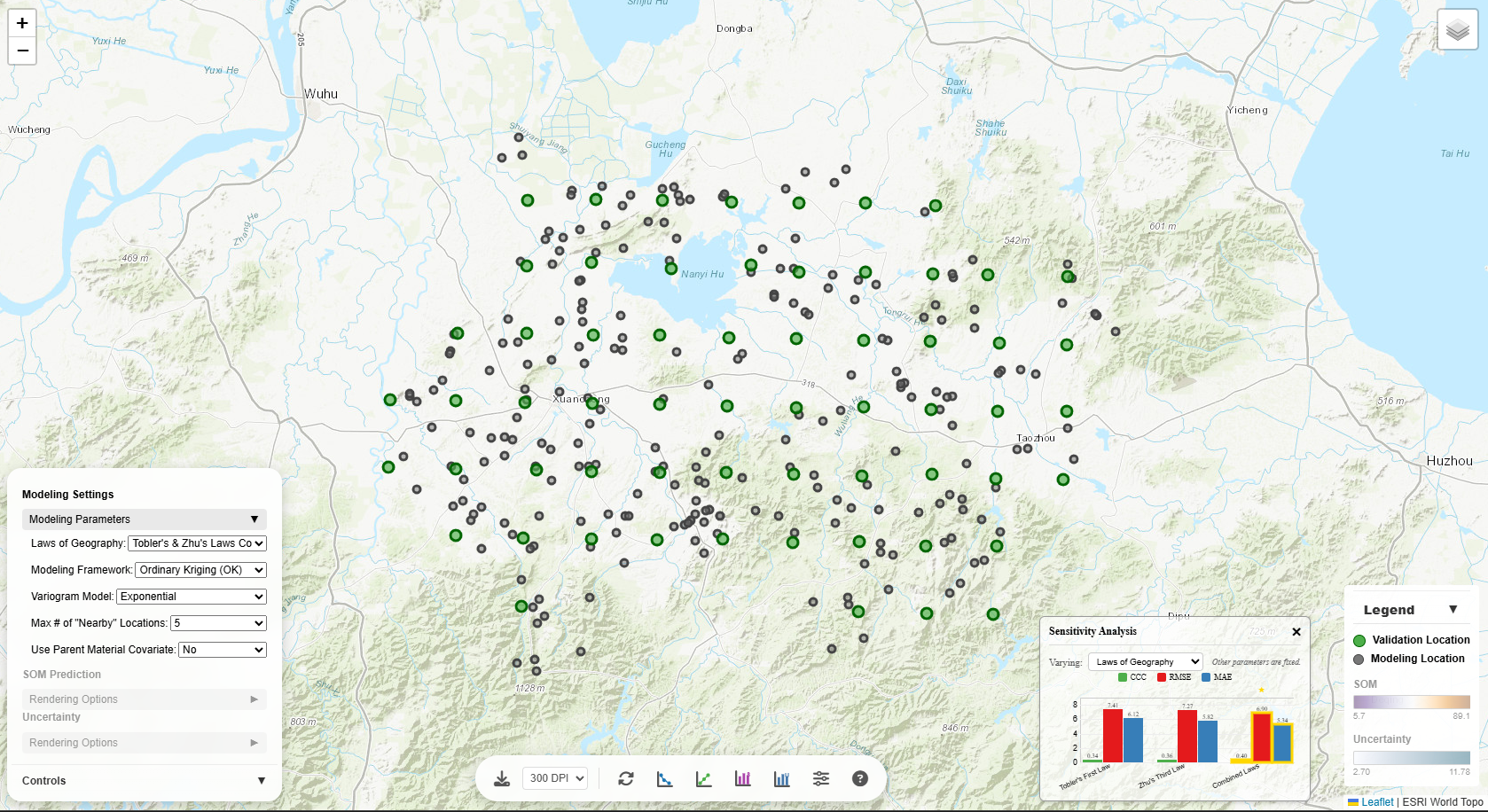
Modeling Settings
The Modeling Parameters section controls the underlying spatial prediction model. Each parameter
significantly affects the prediction results:
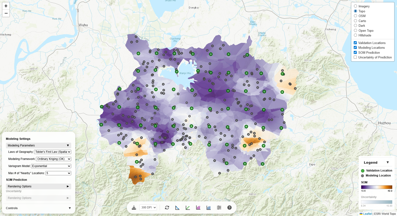
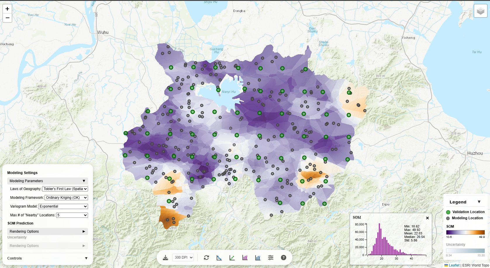
Laws of Geography
- Tobler's First Law (Spatial Autocorrelation): Assumes values of the target variable (e.g., SOM)
at geographically nearby locations are more similar. Best for spatially continuous phenomena (i.e.,
spatially autocorrelated target variables).
- Zhu's Third Law (Environmental Similarity): Assumes the target variable has similar values at
locations with similar environmental conditions, regardless of geographic distance. Useful when
environmental factors drive target variable variation.
- Tobler's & Zhu's Laws Combined: Considers both spatial proximity and environmental similarity.
Most comprehensive approach.
Changing this parameter will reload the model and update all predictions on the map.
Modeling Frameworks
- Inverse Distance Weighting (IDW): Uses the classicalInverse Distance Weighting framework for
determining weights based on spatial distance. This modeling framework is only applicable when Tobler's
First Law is selected.
- Individual predictive soil mapping (iPSM): Uses the Individual Predictive Soil Mapping framework
for determining weights based on environmentl similarity (Zhu et al. 2015; Zhu et al. 2018). This modeling framework is only applicable when
Zhu's Third Law is selected.
- iPSM & IDW Combined: Combines the Individual Predictive Soil Mapping framework with the Inverse
Distance Weighting framework for determining weights based on both spatial distance and environmentl
similarity (Qin et al.
2021). This modeling framework is only applicable when Tobler's & Zhu's Laws Combined is selected.
- Ordinary Kriging (OK): Uses the Ordinary Kriging framework for determining weights. If
Tobler's First Law is selected, the weights of modeling locations are based only on spatial
autocorrelation (spatial distance). If Zhu's Third Law is selected, the weights of modeling locations are
based only on environmental similarity (environmental distance). If Tobler's & Zhu's Laws Combined is
selected, the weights of modeling locations are based on a weighted sum of spatial distance and
environmental distance (where the two distances are equally weighted).
- Regression Kriging (RK): Uses the Regression Kriging framework for spatial prediction. First,
a multiple linear regression (MLR) model is fit to the data to predict the target variable using the
environmental covariates at the modeling locations, then the residuals (i.e., difference between observed
and MLR-predicted values) are modeled using Ordinary Kriging.
Switching modeling frameworks will reload the model and update all predictions on the map.
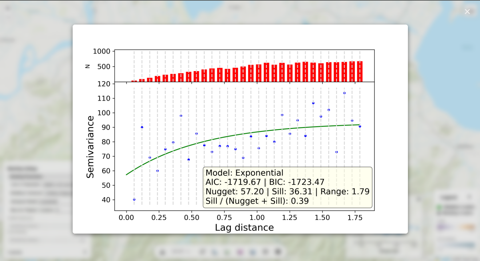
Variogram Model
Applicable only when Ordinary Kriging or Regression Kriging is selected. The variogram captures the
characteristics of the spatial autocorrelation, the environmental autocorrelation, or the combined
spatial-environmental autocorrelation in the data:
- Spherical: Linear increase near origin, levels off smoothly. Good general-purpose choice.
- Exponential: Gradual, asymptotic approach to sill. Best for gradually varying phenomena.
- Cubic: S-shaped curve. Useful for smooth transitions.
- Gaussian: Very smooth near origin. For highly continuous data.
- Stable: Flexible model with adjustable shape parameter.
Semivariograms are displayed for each variogram model (upon clicking on the weight-distance plot).
Different models affect prediction smoothness and uncertainty estimates. Changing this parameter will
update predictions and uncertainty estimates.
Max # of "Nearby" Locations
Controls how many neighboring modeling locations are used for each prediction (i.e., computing a
predicted
target variable value as the weighted average of the neighboring modeling locations):
- Fewer points (5-10): Faster computation, more local variation, may miss broader patterns.
- More points (20-50): Smoother predictions, captures regional trends, slower computation.
- All points: Global kriging, smoothest results, computationally intensive.
Changing this will update predictions and uncertainty estimates (but not the semivariogram).
Distance decay (p)
Applicable only when IDW or iPSM-IDW is selected. Controls the rate at which the weights of neighboring
modeling locations decreases with distance.
- When p is close to zero, the modeling locations are weighted about the same.
- When p is large, the nearest modeling locations are weighted more heavily than the farthest
modeling locations.
- The default value for p is 2.
Changing this will update predictions and uncertainty estimates.
Parent Material Covariate
When enabled (only valid for Zhu's Third Law or Tobler's & Zhu's Laws Combined), incorporates geological
parent material as an environmental covariate (in multiple linear regression modeling and in computing the
environmental distance).
Computing weights under the Ordinary Kriging framework is achieved by using the SciKit-GStat Python library (with a customized
Euclidean distance metric considering spatial distance and/or environmental distance).
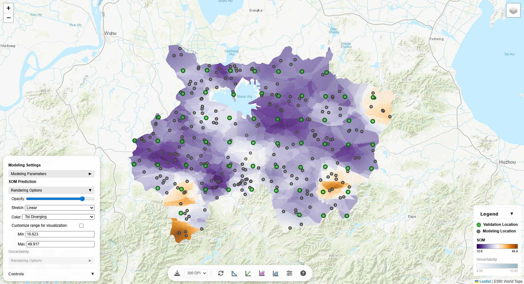
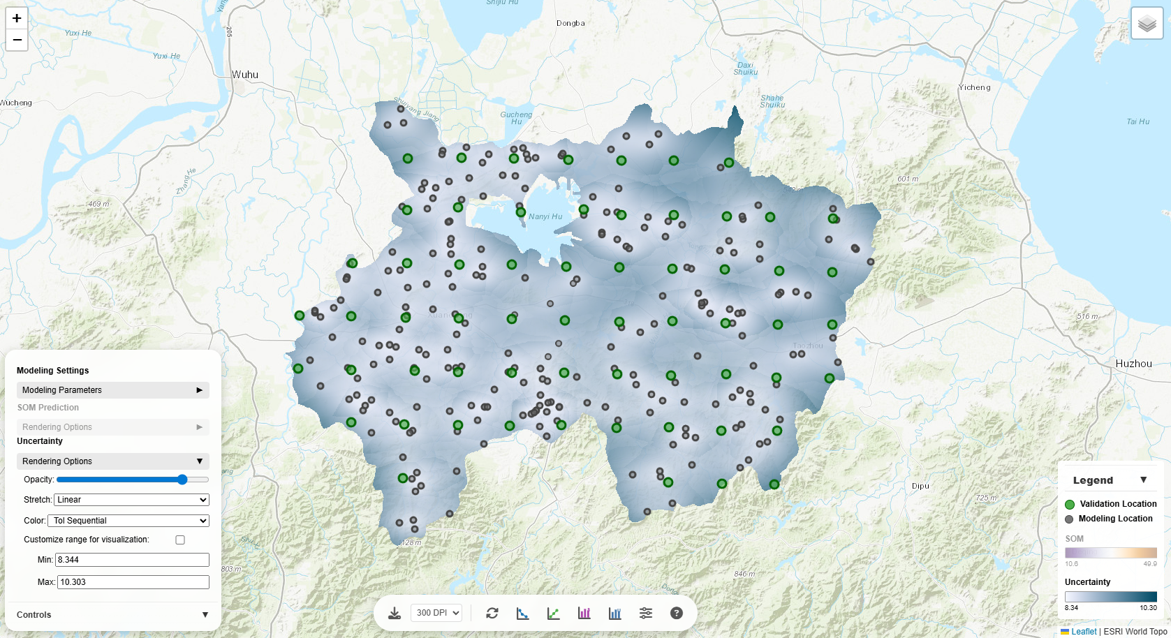
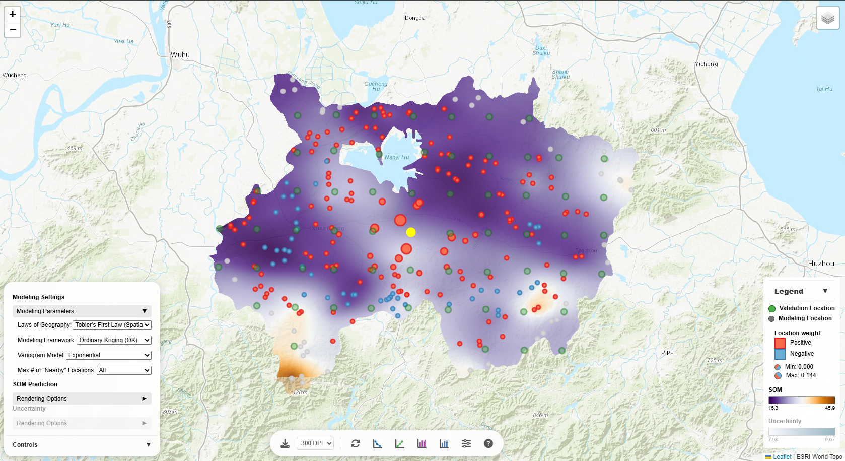
Rendering Options
Customize how the prediction and uncertainty layers are visualized on the map:
Opacity
Controls layer transparency (0 = fully transparent, 1 = fully opaque). Lower opacity lets you see the
base map through the prediction layer, useful for geographic context.
Stretch
Determines how data values are mapped to colors:
- Linear: Direct value-to-color mapping. Best for normally distributed data.
- Square-root: Compresses high values, expands low values. Good for right-skewed data.
- Log: Strong compression of high values. Excellent for highly skewed data.
- Histogram Equalization: Distributes colors evenly across value frequencies. Maximizes contrast.
- Percent Clip (2–98%): Clips extreme values to enhance middle range contrast.
- Standard Deviation: Centers on mean, stretches by standard deviations. Highlights anomalies.
Try different stretches to reveal patterns in your data!
Color Schemes
Choose from 30+ color palettes:
- Sequential (Viridis, Magma, etc.): For continuous data from low to high.
- Diverging (Tol Diverging, RdYlGn, etc.): For data with a meaningful center point.
- Perceptually uniform (Viridis, Cividis): Accurate visual representation of values.
- Colorblind-safe (marked CB-safe): Accessible to colorblind users.
The legend updates automatically to reflect your chosen color scheme.
Custom Range
Check "Customize range for visualization" to manually set min/max values. This is useful for:
- Comparing multiple maps with the same scale
- Focusing on a specific value range
- Excluding outliers from visualization
Interactive Charts
The tool provides several interactive visualizations accessible via buttons at the bottom of the screen:
SOM Histogram
Shows the distribution of predicted SOM values across the study area. The histogram helps
you:
- Understand data distribution (normal, skewed, bimodal)
- Identify outliers or unusual values
- Choose appropriate stretch methods for visualization
Hover over bars to see exact counts for each value range.
Uncertainty Histogram
Displays the distribution of prediction uncertainty across the study area. Higher uncertainty often
indicates:
- Areas far from sample points
- Regions with high spatial variability
- Locations where more sampling would be beneficial
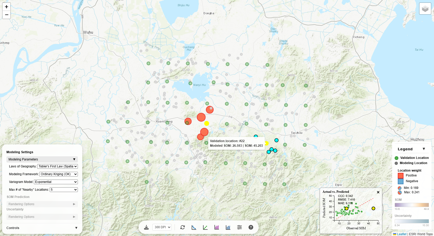
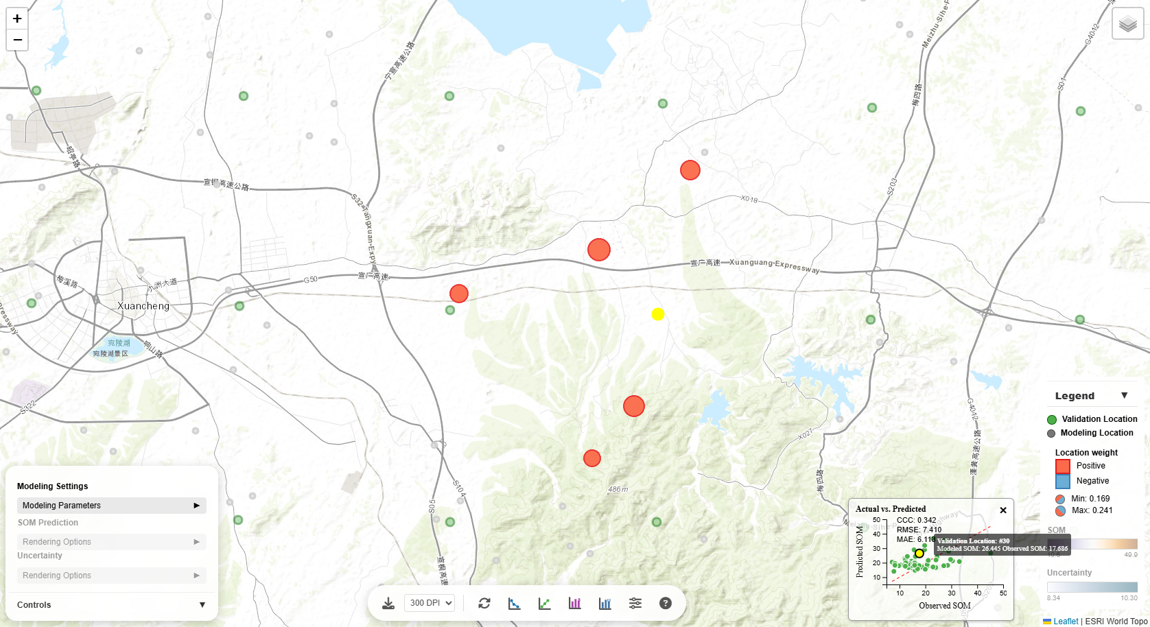
Actual vs. Predicted Plot
Compares observed values (from validation locations) against model predictions. This chart is crucial for
model evaluation in terms of SOM prediction accuracy metrics CCC (concordance correlation coefficient), RMSE
(root mean square error), and MAE (mean absolute error):
- Points near the 1:1 line: Accurate predictions
- Points above the line: Model over-predicts
- Points below the line: Model under-predicts
- Scatter around the line: Indicates prediction error magnitude
Interactivity:
- Hover over points: See a tooltip with the validation location ID, observed value, and predicted
value
- Click a point: The corresponding validation location on the map is highlighted, and
contributing modeling points are shown with sized/colored circles (in accordance with the sign and
magnitude of their weights towards the prediction at the validation location)
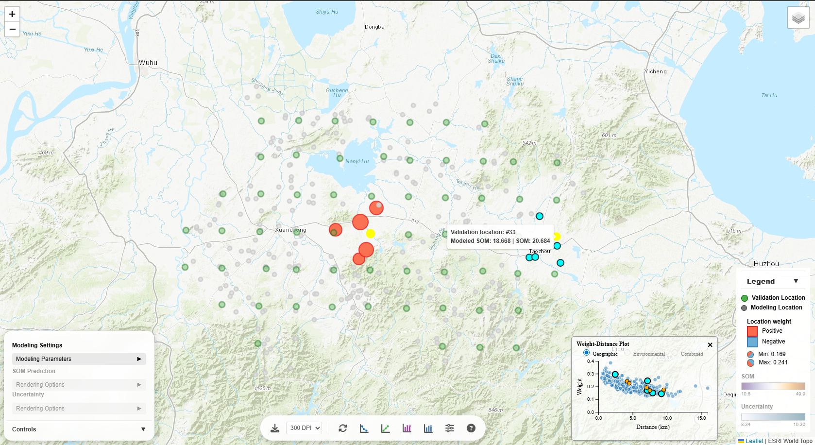
Weight-Distance Plot
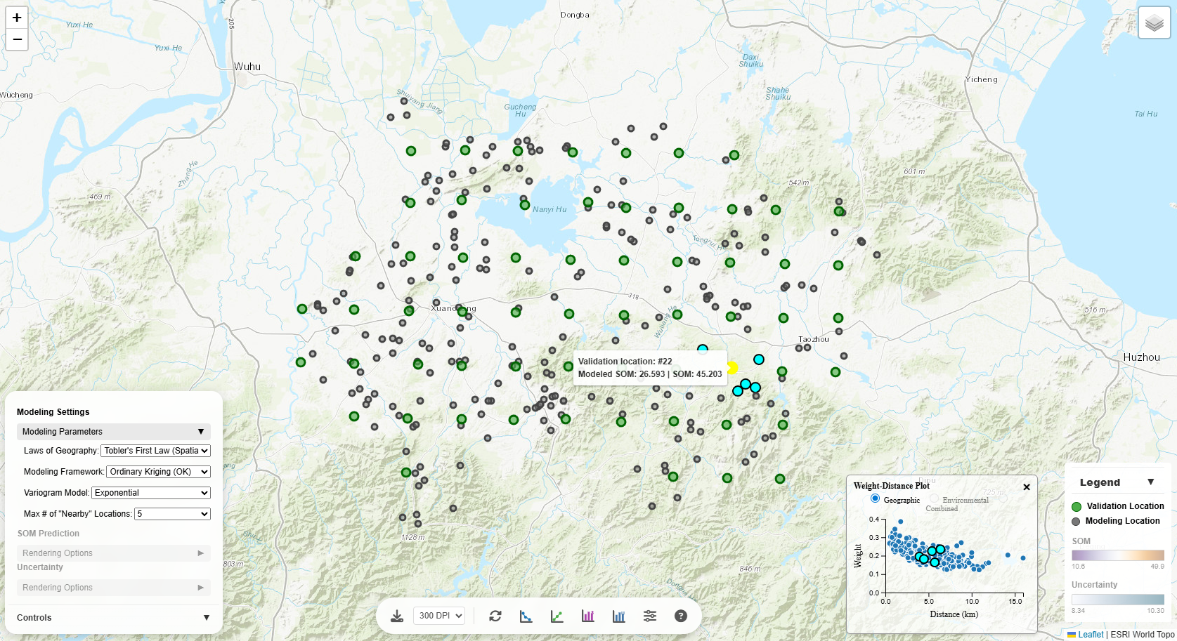
Displays how weights of the modeling points vary with distance from the prediction location, as measured
in:
- Geographic space: Spatial distance
- Environmental space: Environmental similarity (for iPSM methods) or distance
- Combined space: Distane in the combined spatial and environmental space
Interactivity:
Hover over points: See a corresponding validation-modeling location pair on the map highlighted.
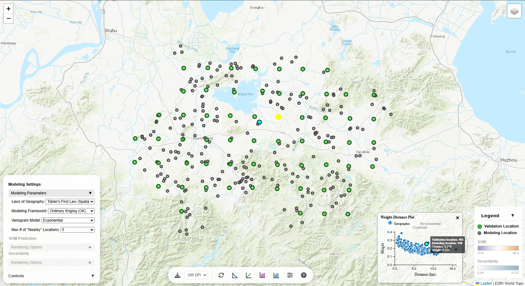
Click the weight-distance plot to view the underlying variogram model in full size (applicable only to
kriging models).
The fitted variogram model captures the characteristics of the spatial autocorrelation,
the environmental autocorrelation, or the combined spatial-environmental autocorrelation in the data.
The semivariogram reveals:
- Nugget: Measurement error or micro-scale variation (y-intercept)
- (Partial) Sill: Total variance in the data (plateau level) minus nugget
- Range: Distance at which spatial/environmental correlation becomes negligible (where curve
levels
off)
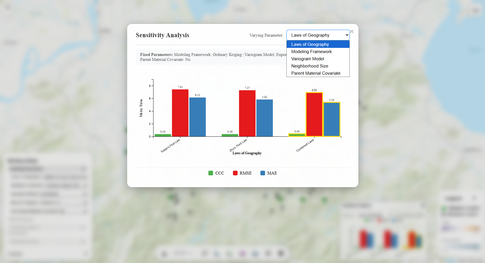
Sensitivity Analysis
The sensitivity analysis is fully interactive with multiple ways to explore how different modeling
parameters affect the prediction results, in terms of SOM prediction accuracy metrics (CCC, RMSE, MAE):
Map Interactions
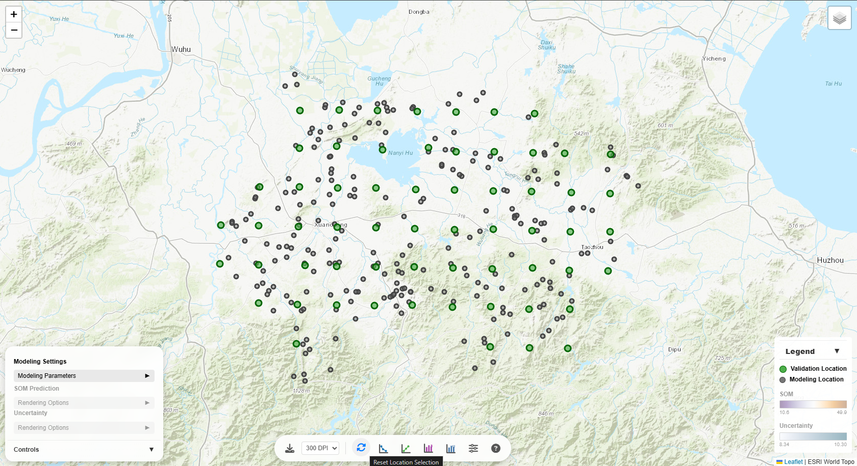
The map is fully interactive with multiple ways to explore the data:
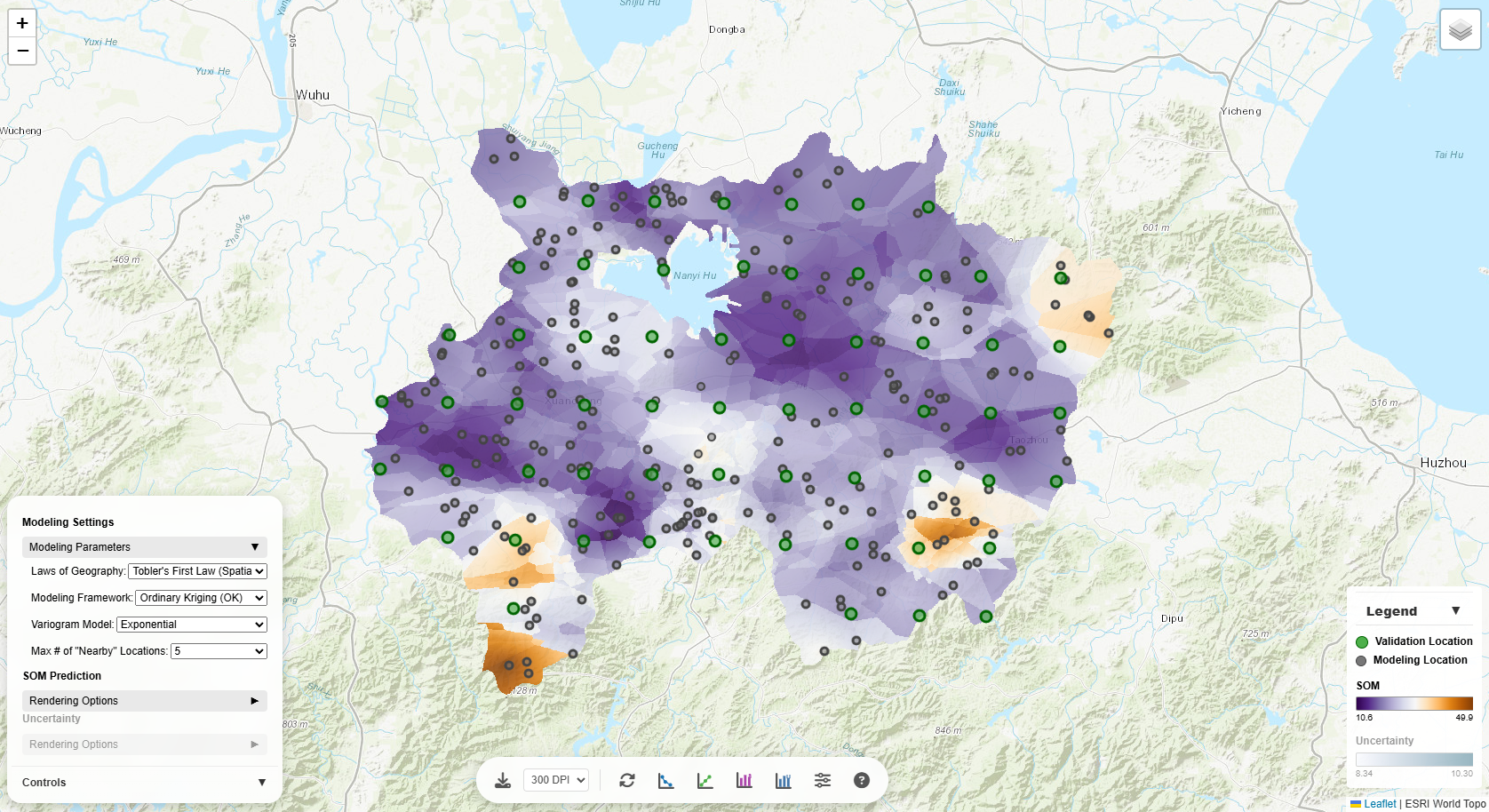
Basic Map Interactions
All kinds of basic map interactions supported by Leaflet.js are available:
- Zoom in/out
- Pan
- Layer (visibility) control
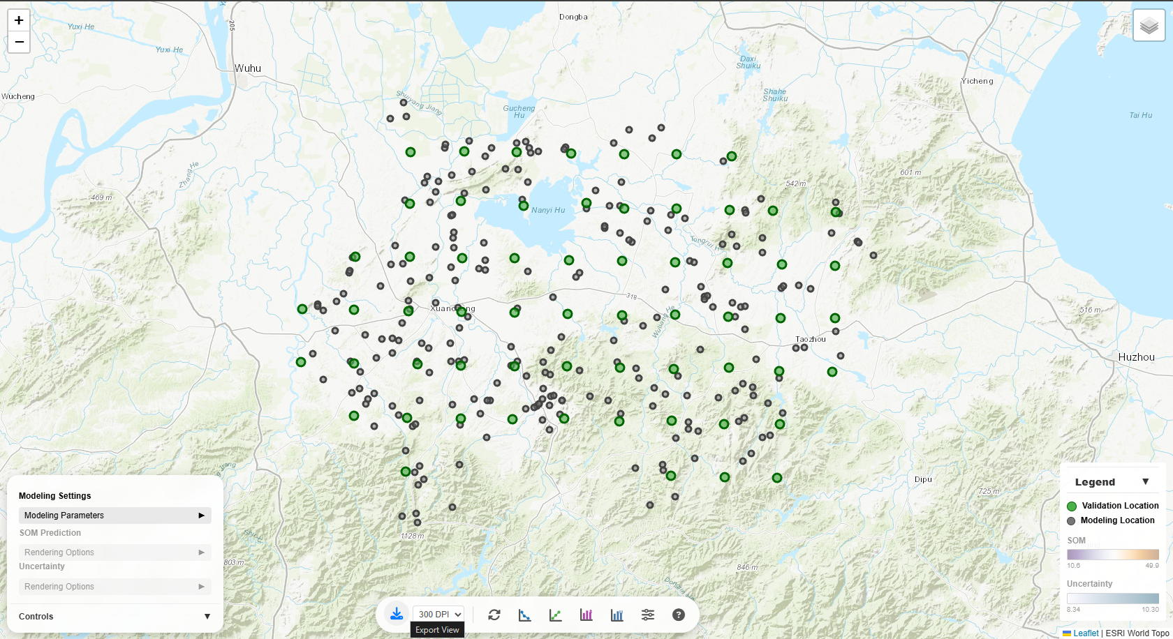
Validation Location
When you click a validation location (green circle), several things happen:
- Popup appears showing the observed SOM value and location ID
- Contributing modeling locations are highlighted as colored circles around the validation point
- Legend updates to show:
- Location Weight section appears
- Positive weights: Red/orange circles - locations that increase the prediction
- Negative weights: Blue circles - locations that decrease the prediction
- Circle size: Represents the magnitude of weight (larger = higher weight)
- Weight range is shown in the legend (Min and Max values)
This visualization helps you understand which nearby locations are most influential in making
predictions.
Actual vs. Predicted Plot
The Actual vs. Predicted scatter plot is linked to the map:
- Hover over a point: Tooltip shows validation location ID and SOM value. And the corresponding
validation location and its associated modeling locations on the map are temporarily highlighted.
- Click a point: The map automatically pans/zooms to that validation location and
highlights it
with contributing modeling locations
This two-way interaction lets you seamlessly explore model performance both statistically
(Actual vs. Predicted scatter plot)
and spatially (map).
Weight-Distance Plot
The Weight-Distance scatter plot is also linked to the map:
- Hover over a point (on scatter plot): The corresponding validation-modeling location pair on the
map are highlighted.
- Click a validation location (on map): The map highlights the validation location with
contributing modeling locations. The points on the scatter plot corresponding to the validation-modeling
location pairs are highlighted as well.
- Hover over a validation location (on map): The map temporarily highlights the validation location
with
contributing modeling locations. The points on the scatter plot corresponding to the validation-modeling
location pairs are temporarily highlighted as well.
This two-way interaction lets you seamlessly explore model performance both statistically
(weight-distance scatter plot)
and spatially (map).
Legend
The legend in the bottom-right corner is dynamic:
- Click the legend header to collapse/expand it
- SOM section: Shows the color scale for predictions with min/max values
- Uncertainty section: Appears when uncertainty layer is visible
- Location Weight section: Appears only when a validation point is selected, showing the
weight of contributing modeling locations
Reset & Export
Click the "Reset Location Selection" button to clear all highlighted points and return the
legend
to its default state.
Click the "Export View" button to export the current view to a PNG file. User can select DPI and
file name. Some base map may not be exported.